Yesterday, I launched covid.observer, the website displaying Coronavirus statistics. Unlike the most sources, this site tries to deliver the same data to avoid panic.
It is obvious that the numbers are growing every day, but it is also important to realise two facts.
First, as of today, the fraction of people with confirmed infection is very small comparing to the whole world population.
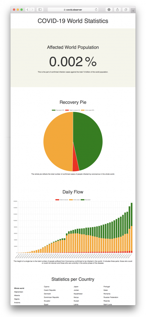
There are three main graphs for each country and for the whole world:
- The fraction of people with confirmed diagnosis against the whole population.
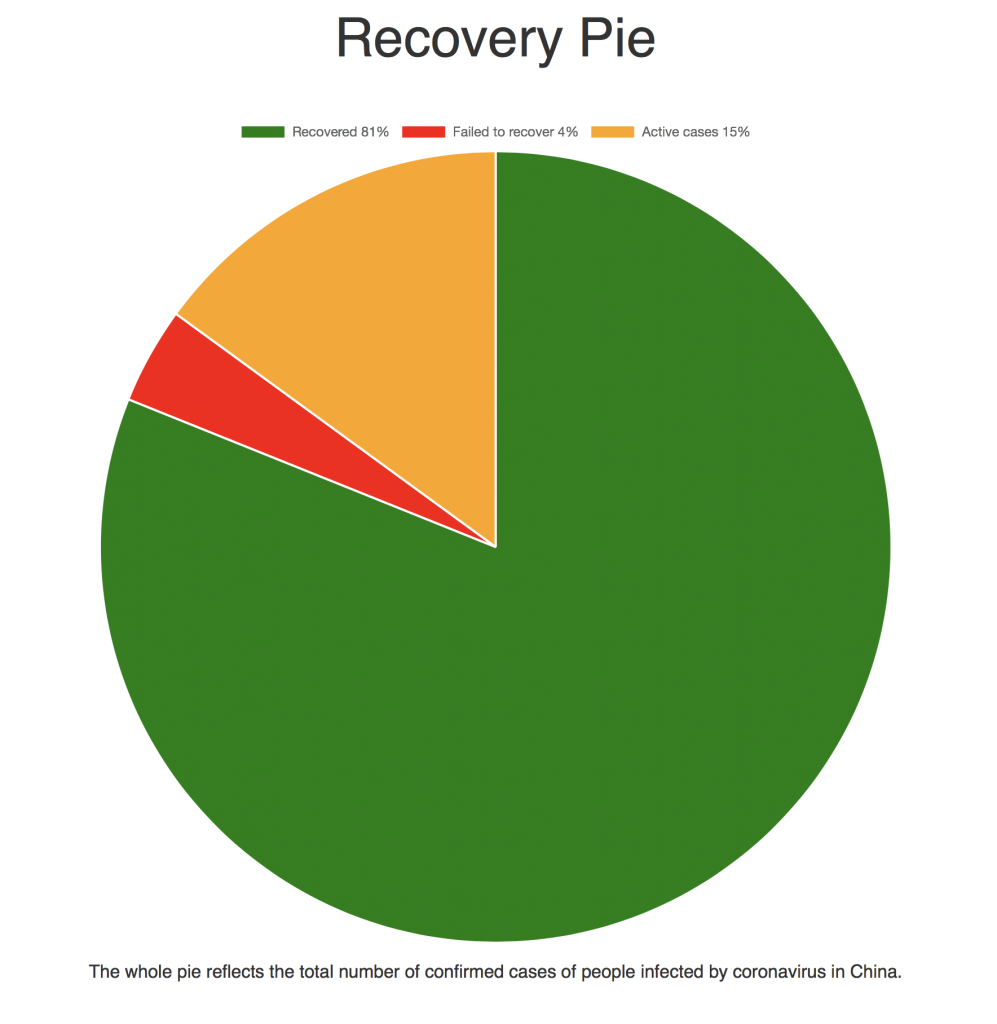
- A pie comparing recovered, failed to recover, and active cases.
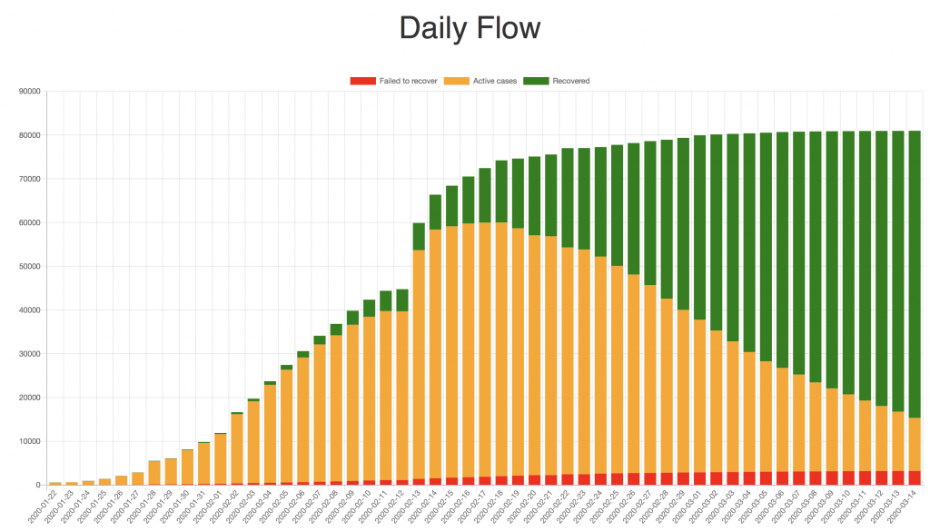
- The same data displayed on a timeline histogram.
I would like to put your attention to the statistics of China.
Here is a pie chart where you can clearly see how many people recovered (comparing to about 50% in the whole world for today).
And here is the timeline. You can clearly see that the spread has been stopped, and the number of recoveries grows every day.
I am using the same data that the famous dashbord from the Hopkins University. They opened publicly available daily updates which are collected from multiple world-wide sources.
As an unimplemented wish, I would like to find and add data about the age distribution of infected people.
The source code of covid.observer is available on GitHub.
Hi Andrew,
Thank you for Covid observer. Could you add switcher between normal-log10 vertical scale to graphs?
Cheers
Hi, thanks for the idea! I’ve added it wherever relevant.
It’s me again, with another suggestion:
for daily speed growth to reflect negative values on log scale I would suggest to calculate log of absolute value and plot that on graph with inverted vertical axis right beneath what you have now.
I think it should say deaths, not failed to recover.