This day, a month ago, the covid.observer site was launched. The time during the coronavirus pandemic flies differently. For some, it is extremely slow, for some, one month passed may be equivalent to a year. In any case, let me give an overview of the changes happened to the site during this time.
Here is a comparison of how the front page looked like a month ago (on the left), and how it looks like today (on the right).

The site began as an attempt to understand it myself and to demonstrate to the others what is the real size of COVID-19 World spread comparing to how it is seen and heard from mass media. That’s why the first three blocks that entered the site were the Recovery Pie, the Daily Flow graph, and the Percent of the affected population. A very important thing is to give fair information about the number of recoveries.
A month ago, China’s numbers were considered so high. Today, they are so small comparing to the numbers in Europe and North America. Look at the graph comparing active coronavirus cases in different continents. China’s data are mostly equal to the total Asia’s numbers before the beginning of March, and they only gave a low two-month-wide spike, whose height is ten times smaller than the current values in Europe and North America.
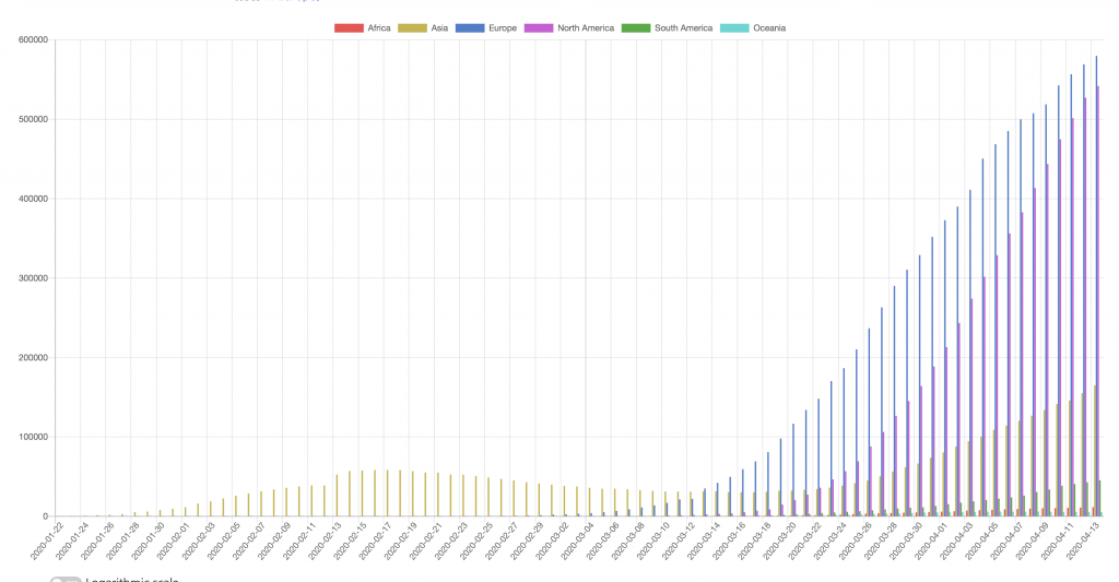
Don’t miss the new growth of the spread in Asia (golden bars on the graph below) and the rising trend in South America (green bars, which are low today but are growing every day).
On the other side, if you look at the fraction of the total population affected (that is, of those with a positive COVID-19 test), it changed from 0.0019% to 0.025% during the last month. You may look at it at as a 10x increase, but don’t enter into panic trying to extrapolate these numbers and think that in a few months more people will be sick than there is on the whole Earth today. The number of affected people is well below 1% today (it reaches 1% in New York only), and the trends in some of the most affected countries (such as Italy and Spain) seems to be passing their maximum values.
OK, let me return to the site itself. There is a list of the main changes on the “What’s new” page.
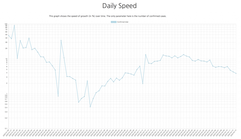
Among them, the graphs of the daily speed, where you can see if there are more or fewer new cases every day. Such graphs are available for the whole world, for all the continents, for separate countries, and for different regions in the USA, China, and Russia.
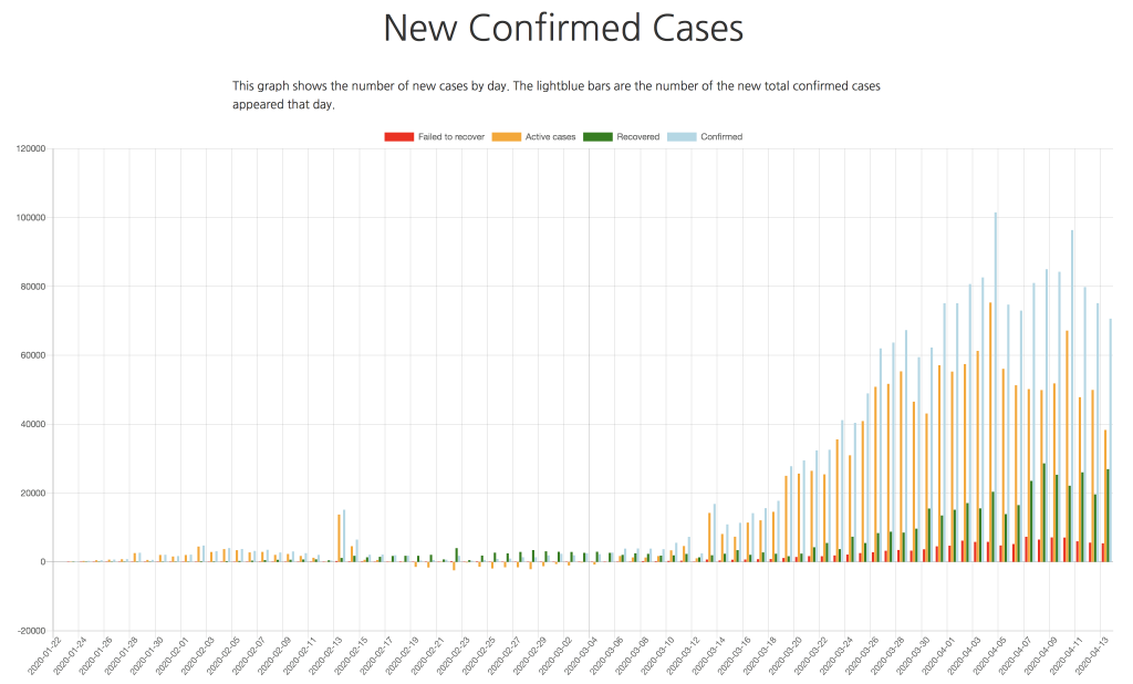
Another new graph is the number of new cases—confirmed, recovered, and fatal. Again, for every possible slice (World, continent, country, region).
Such graph may be a good source to look at to understand how good the quarantine measures work in your country. For example, in the Netherlands, the good weather during the last week pulled people out of their homes, and the number of new cases—after a couple of attempts to drop—did not want to decay.
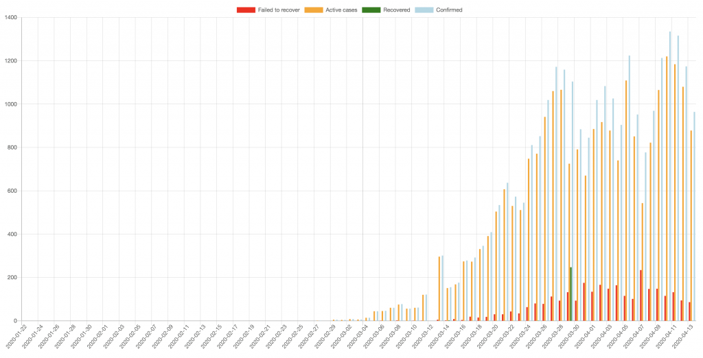
Unfortunately, the methods of counting new cases vary a lot not only across different countries, but even within the same country at different times. It may happen that only people with strong symptoms are counted, while there are a lot of people who were infected but they stay beyond the official statistics. Moreover, the number of recoveries is sometimes (as in the case of the Netherlands), is not reported at all. This breaks the fair picture.
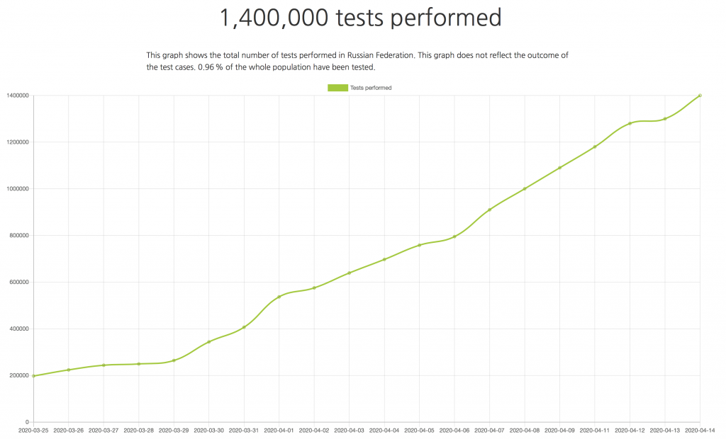
The good part is that, for example, since April 13, all the US states report the number of recoveries. Some countries are also reporting the number of people that were tested against COVID-19. It is not quite clear, what those numbers actually mean. Is it the number of tests, or the number of people tested (for example, what if a person was tested twice, first to confirm they’re ill, and then to confirm they’re recovered)? Are these test numbers reflect the number of tests started today or the number of tests with the know results (as we know tests are not instant)? In any case, it is great that we have such numbers, even if not for every country. Here’s the graph for Russia:
The main datasource that covid.observer is using is the data collected by the Johns Hopkins University’s department publishing the updates in their GitHub repository. We should really thank them for their daily work even despite a number of unexpected format changes that I have to quickly adapt to 🙂 There were two major data format changes during the last months. Unfortunately (for us), the JHU’s data is US-oriented: there are very detailed (per-city!) records about the US, while there are only country-level number for the rest of the word (with very few exceptions such as China). For a few countries (North Korea or Turkmenistan being among them) there are no information at all.
There are two more sources of COVID numbers that I started to import on a daily basis. These are the numbers for Russia and Ukraine. I could not find any official data source where these numbers are properly gathered to some kind of table, would that be an HTML table or a CSV file. So, the only possibility is to copy daily data from the official resources and save them locally. I hope, someone will find it useful to pick the daily files I collected in a repository. Or use the CSV/Excel export that was added to every country next to the table representation (which was also added during the last month).
Among the other visualisations, there’s a pair of the World Map and World Overview, where the colour of the country reflects the growth of the new cases. This substantially differs from the maps where only the total number of confirmed cases is displayed. I find it very important to reflect the changes that happen in both directions.
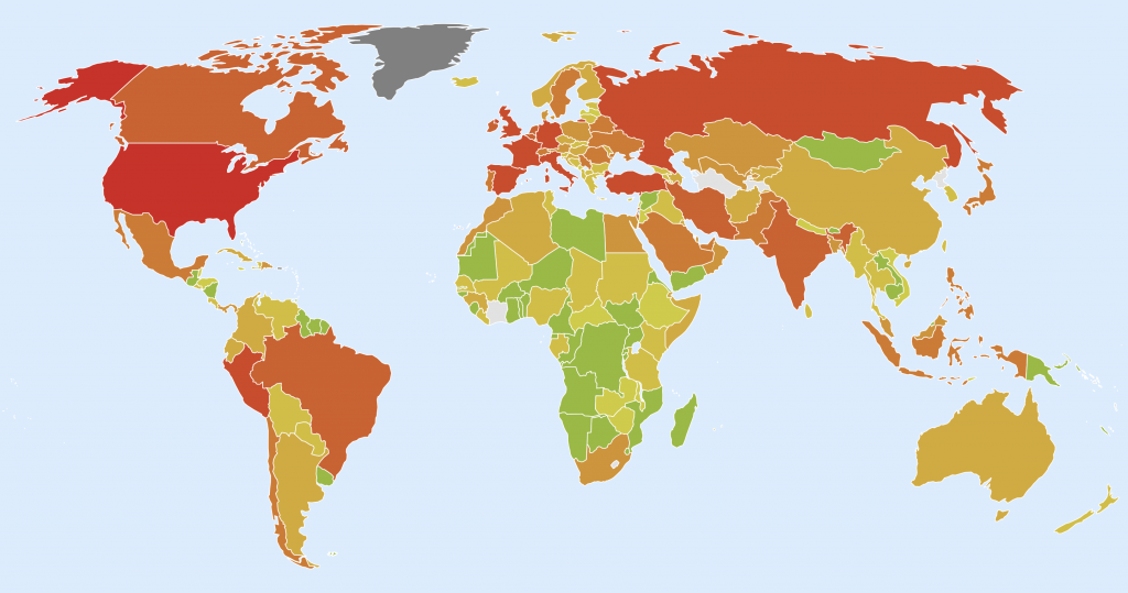
Another important aspect which you don’t have to miss when interpreting the COVID-19 data is that the absolute numbers are often misleading. A better values for comparison are per capita numbers. In our case, that’s the number of confirmed or fatal cases per each million of the population. These values allow you to compare the countries and make your conclusions.
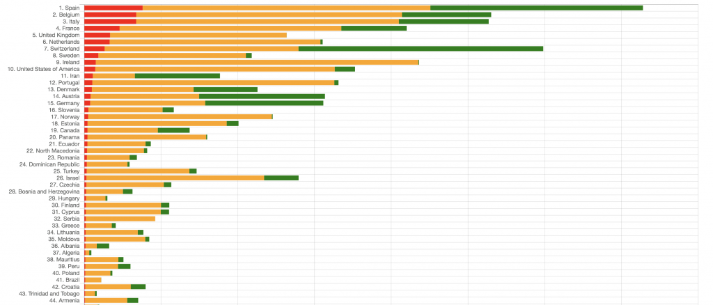
Actually, it is better to have the numbers of the cases per 1 thousand, not per 1 million, as for small countries such as Vatican, you get huge numbers which exceed their population. These per-1000 values are even more interesting, as they allow us to compare the current people losses with the overall mortality over the previous years.
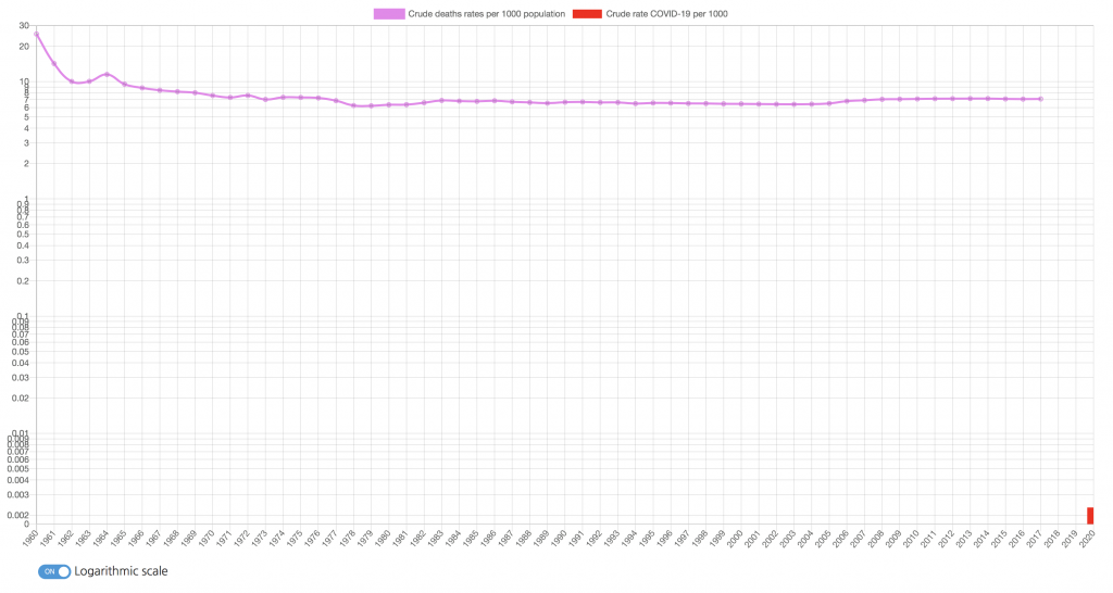
There are public data that the United Nations and the World Bank publish, and they are also used on the site. You can compare the ‘standard’ mortality with the number of people died during the Coronavirus pandemic. In most cases, these numbers are significantly lower (they are so small that a logarithmic scale is turned on by default for such countries). In some cases, they are up to 1/4 of the general background, but we don’t know yet if the COVID numbers are added on top to it or included in it.
For the crude deaths number graphs, I deliberately chose these graphs to look ‘empty’. See, for example, the graph for China. Every year, about 7 people dies from each 1000 of population. During the three months of pandemic, only 0.002 people per 1000 were lost (reaching 1.2 per 1000 in Hubei). Without the logarithmic scale, you cannot even see it.
Finally, another interesting set of graphs that is an overview comparing different countries (and also regions for the US, China, and Russia).
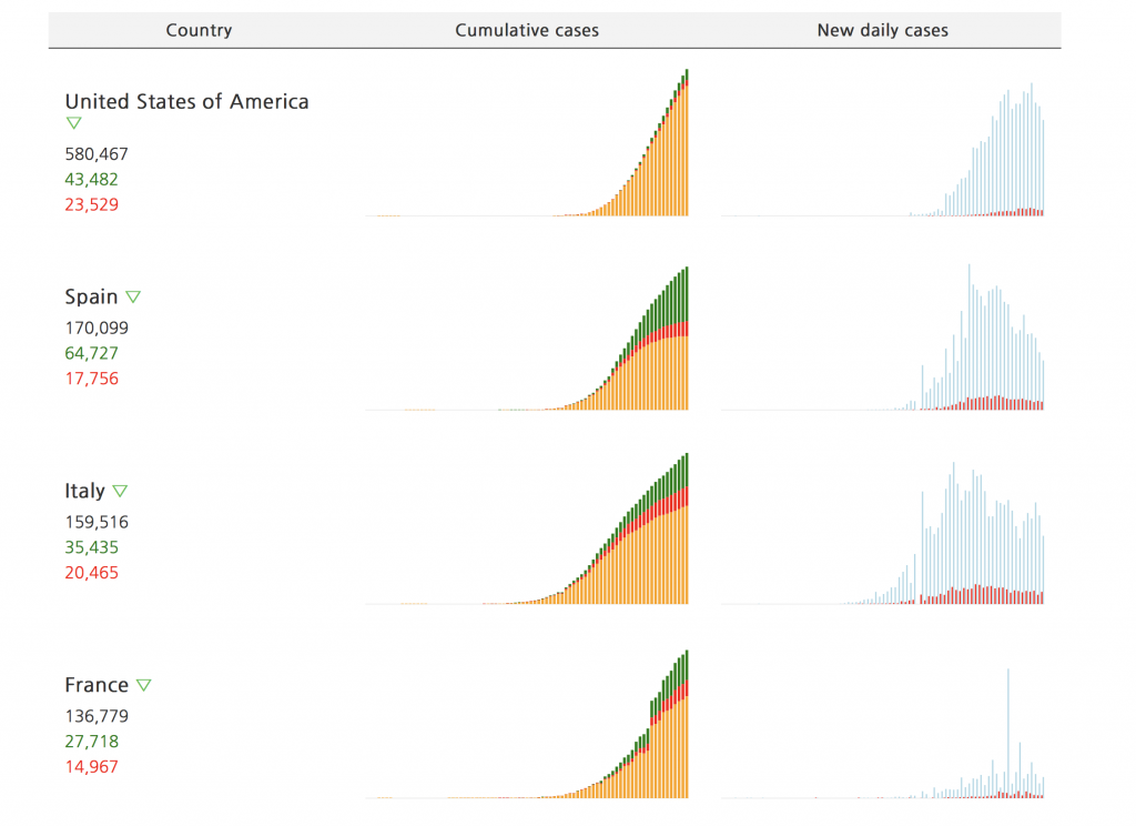
This table is sorted by the infamous number of total confirmed cases, but you can see that the most affected European countries are about to recover soon.
China, although its numbers are not that high today comparing to other places of the World, is interesting also because you can look at it to see the future (not in the economic sense, which is a separate discussion, but just for the possible future numbers of the coronavirus spread). In some provinces, there is a notable second peak.
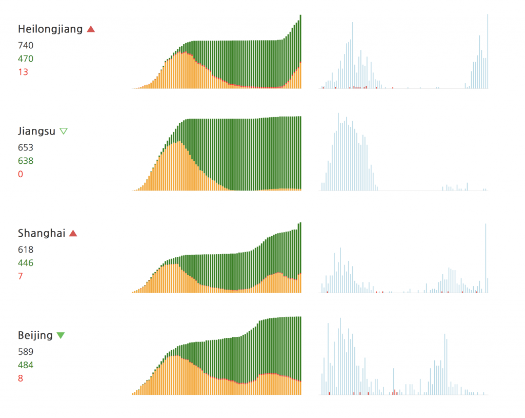
While we also may expect the new wave in both Europe and Americas, we can also see that it is less strong.
And let me stop here for today. Visit the covid.observer, make use of its data, and stay healthy. I am going to add more interesting features in the following days, would I have time for doing that.